In conversation with: Francesca Rowan Plowden
 We recently sat down with renowned interior designer Francesca Rowan Plowden - founder and creative force behind Rowan Plowden Design Ltd, a studio celebrated for its thoughtful approach to period property design. With more than a decade of experience restoring and designing historic homes, sprawling estates and private residences, Francesca brings an expert eye to every project she touches. She’s become a trusted voice in interiors thanks to her engaging design content and real-world advice shared with her community across social media.
In this interview, we tapped into her wealth of experience to answer some of your most asked questions - from the small details that make the biggest impact in a space, and the DIY design wins that anyone can tackle at home, to the trends she sees shaping the interior landscape in 2026. We also explore how to add personality through colour and thoughtful design, whether you’re revamping a new build or decorating a rental.
Which small details do you think make the most impact in a space?
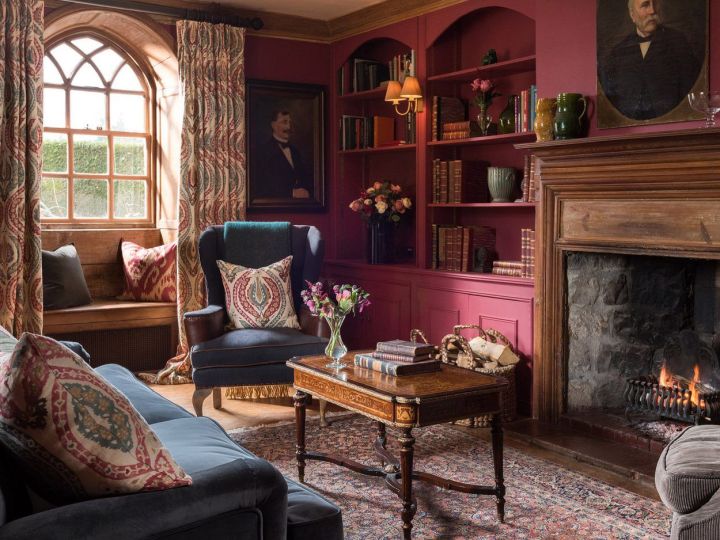
My three rules in making the most impact in a space are colour, art, and lighting. Colour helps to transform the feeling of a room – whether it’s meant to be warm and cosy, light and airy, or restful. This can then be further enhanced depending on how you incorporate lighting. I will always opt for side lighting rather than overhead; it’s far softer and by using dimmers, it can be adapted to match the mood. Similarly, you can’t underestimate the effect good artwork has. The right art can make any space beautiful, and it has the ability to unite interiors, so they feel purposeful and considered.
What would you recommend doing to make low ceilings feel higher?
A simple but very effective trick is to introduce a horizontal break around two-thirds of the way up the wall, either by painting the upper section in a contrasting shade or by installing a picture rail and painting up to it. This draws the eye upward and creates the illusion of height. Keeping the ceiling colour lighter than the walls also helps it visually recede, while vertical elements such as full-height curtains or slim wall lights can further emphasise height and make the space feel more generous.
W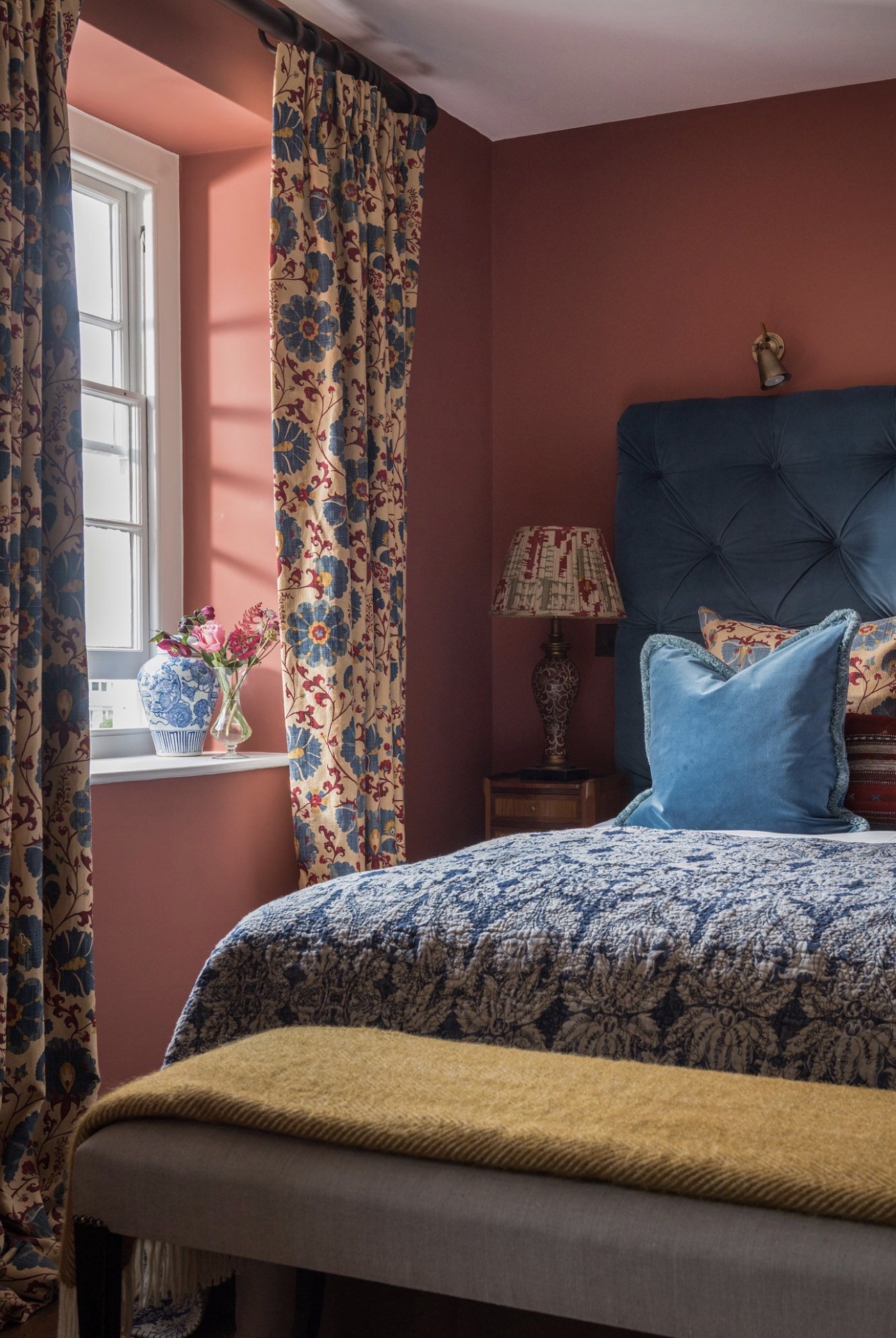 hat colour palettes tend to work well together?
Some of my favourite combinations include pink with green, or pink with yellow - both pairings feel fresh and uplifting, instantly bringing to mind the optimism of spring. They’re joyful without being overpowering and work beautifully in spaces where you want to create warmth and energy.
Layering deeper jewel tones, such as blue and green, is another approach I often return to. Because these colours share similar undertones, they sit very comfortably together and create a timeless, sophisticated look with a wonderfully cocooning feel.
Introducing a secondary colour as an accent can also be incredibly effective. Whether it’s highlighting woodwork and cornicing, or bringing definition to key pieces of furniture, these thoughtful contrasts add depth, character and a sense of considered design to the room.
Are there any DIY wins that can be easily achieved by homeowners?
Spend a rainy weekend re-painting your cupboards, doors and skirting boards and that’s time well spent! It’s a brilliant way to refresh your interiors and the result often feels like you’ve done more work than you have. Also, making some easy swaps, like changing cabinetry and door handles, can make the world of difference. High quality hardware, such as handles from Corston, can elevate a not-so-expensive cabinet so that it looks far more expensive than it is.
If you have some electrical knowledge, updating your sockets and switches with sleek alternatives is another way to elevate a space – although I’d recommend getting an electrician to help with this if you’re not sure how to do it.
 What trends are here to stay in 2026?
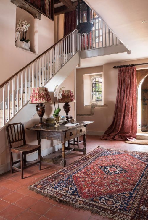
A sense of nostalgia is here to stay – whether it’s the use of retro colours or the continued popularity of traditional prints, such as William Morris. I certainly think people are fighting against the need for ‘perfect’ interiors – perhaps in response to hours spent scrolling through social media and those too-good-to-be-true photos that flood our feeds. The antidote to this is the ‘lived in’ look; imperfections and everyday objects shouldn’t be hidden away, and there’s a magic to interiors that have been curated and built over time.
Another trend likely inspired by social media is the popularity of mid-century and Art Deco furniture and accessories. You can often find fantastic value for money with second hand furniture, and again, it’s a great way to add personality and individuality to a space.
How can I add character and personality to my new-build home?
New-build homes are often very neutral, so introducing colour is a brilliant way to make the space feel ‘yours’ and more homely. See the house as a blank canvas where anything is possible. And if this feels daunting, spend some time building up a mood board of what you like – this can be easily done on Pinterest, and will certainly help to spark inspiration.
Again, updating handles, sockets and switches is a quick route to making everything feel more expensive and considered throughout the home. There’s also a tendency for new-builds to have grey carpet which I feel can be very repetitive and nondescript. I’d recommend either pairing it back to bare floorboards or layering with eclectic rugs.
I’m not able to paint my rental home – how can I add colour to my interiors when the walls have to stay the colour they are?
Painting the walls isn’t the only way to add vibrancy to your home – bright and colourful accessories, such as artwork, cushions, and throws, can have just as much impact. Once you have incorporated some colour, mirrors are then the perfect way to amplify it by reflecting the colour across the space. Plus, the added bonus of this approach is that all of this can be taken with you when you move home.
What typical interior design ‘traps’ should I try to avoid falling foul of?
My biggest tip is always to not fall for a trend just because it's fashionable. You’ll enjoy the space so much more if it’s to your own taste and style. In a situation where you are following a trend, it’s worth trying to put your own spin on it so that it still feels personal to you.
I always also advise people not to impulse buy – really think how the item works in your space and with the flow of the house. For example, sometimes a piece of furniture can look amazing in the show room or at your friends house, but just doesn’t work in your space – whether that’s because of its size, colour, or even the light in the room.
Header: Battel Hall at Leeds Castle © Dan Goldsmith
Goodnestone Park © Katya de Grunwald
Battel Hall at Leeds Castle © Dan Goldsmith