
Housing Futures: Is This Sustainable?
In the UK, housing and non-residential buildings account for 17% of total carbon emissions. In this Housing Futures chapter, we explore how sustainability plays a part in households’ home move in 2024.
Have you ever pored over paint charts and spent hours studying different samples on your walls? If so, you’re in good company. Colour has a profound impact on the way a home looks and feels, but choosing the best shade can often feel like a big decision. To help inspire you, we’ve explored how a striking use of colour has shaped three very different rooms in homes currently on the market.
New Farm, Great Dunmow
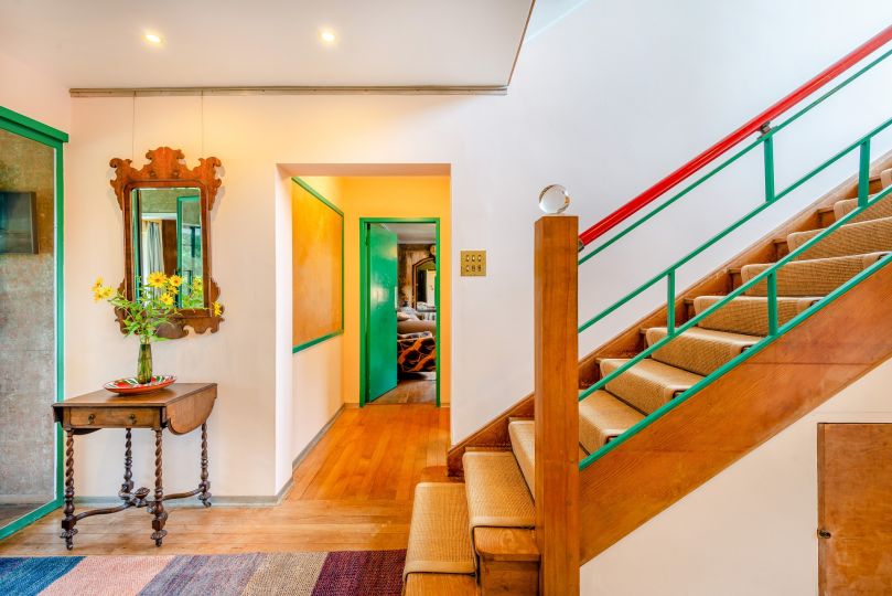
New Farm near Great Dunmow, Essex, already had history and character in spades when Tim Kirby and Sarah Hodgson bought it in 1994.
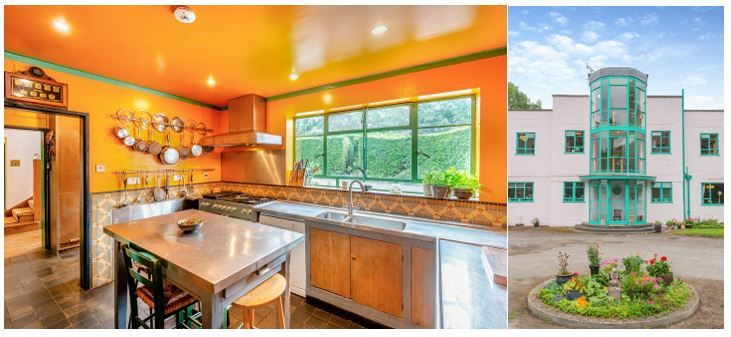
The 1930s art deco house was built by, and became home to Walter Crittall, whose family established the iconic Crittall Metal Window Company.
Walter had a flair for design. He joined the family firm and reportedly spearheaded its design work. In fact, his interest is believed to have spanned areas including architecture and furniture.
This heritage could prove intimidating for some people, but Sarah has embraced it at New Farm. The Grade II-listed house has been carefully preserved over the years. Many original details still exist, such as the Crittall windows, the wood-panelled octagonal dining room, and the oriental wallpaper.
Outside, the six-bedroom home is a combination of pink walls and turquoise steel window frames. And inside, bold colours flash through the rooms. So what inspired the colour scheme in the kitchen?
Sarah explains: “The mosaic tiles on the walls, the wooden kitchen cabinets with brass handles, the stainless steel worktops and the black quarry floor tiles were all there when we moved in. We wanted to find something to complement that.” It’s a very efficient kitchen that is designed to work, she says. “I wanted it to be warm in feeling, welcoming and cheerful.”
The answer? To pick out the subtle colours in the tiles and amplify them. Sarah plumped for a shade similar to that of egg yolk. “Our colours are strong and vibrant. The room glows,” she says.
Sarah opted to paint the ceiling the same shade as the walls too. “The ceiling makes the room feel warm and cosy. It pulls it all together,” she says, before adding that a white ceiling “would have been boring”.
The strip of green where the ceiling and walls meet was suggested by the decorator - and Sarah hasn’t looked back: “That is very art deco. It separates the ceiling and walls. It defines it,” she enthuses. “The room is fun. It’s turning the volume up on the colours. The rest of our house is colour. A statement-coloured kitchen seemed in keeping with it.”
The vibrant shade of green is extended to the kitchen’s window frames and doors, while the door frames are black. This attention to detail is a trait that would no doubt impress Walter.
New Farm is on the market for £1,650,000.
Eckington House, Ripe
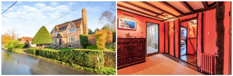
At first glance, Eckington House looks quintessentially English. Dating back to around 1620-1640, the Grade II*-listed home near Lewes, East Sussex, is packed with historical features. But beyond its red brick facade, it is bursting with vibrant colour.
Jacqueline White and her husband bought the village house in 2013. No stone was left unturned as they set about meticulously fully restoring it, working closely with conservation officers.
Jacqueline has a longstanding interest in interiors, fuelled by subscriptions to magazines, such as The World of Interiors and House & Garden. She’s also picked up books by big names including Ros Byam Shaw and Ben Pentreath. “I like to give a home character,” she says.
This has put her in good stead for masterminding the interiors at Eckington House, where original features meet bold colours head-on.
Jacqueline says: “It’s a gutsy house. It’s a little fortress! Pastel colours would be lost. I thought: ‘Let’s go for block colours.”
Unusually, the hallway is a windowless room at the heart of the house. Jacqueline explains: “The house was built by a wealthy local sheep farming family. At the time, it was considered a state-of-the-art house. It’s one of the first houses with a front door that leads into a lobby with rooms off it. Before, you’d come straight into the hall.”
Jacqueline wanted a warm colour for the hallway, which used to be a bakery and dairy. It needed to be a shade that would go with the floor tiles and the striking drinks cabinet, made by the corkscrew designer Alessandro Mendini. “We bought it in Notting Hill years ago and it’s followed us everywhere!”
She put lots of paint samples on the walls and watched them in different lights. At first, she thought a blue colour would work but she changed her mind, concluding it would be too cold.
Jacqueline says: “I wanted bold and earthy colours that were strong. This colour, Orange Aurora by Little Greene, appealed. And it went really well with the green and the dark plum colours in the other rooms.”
She adds: “It’s a dark hallway but when the sun comes out, it just glows!”.
Eckington House is on the market for £1,950,000.
The Gables, Warmington
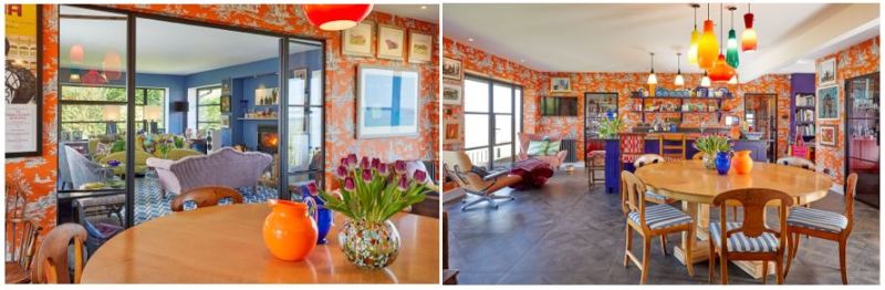
Located in an idyllic spot on a Cotswold escarpment, The Gables is a much-loved contemporary home that has been carefully curated.
Harriet Gubbins and her husband bought The Gables a couple of years ago and breathed new life into it. They knocked down walls and opened up the property to increase the natural light and to make the most of the panoramic views of the surrounding countryside. Harriet says: “You look at the view all the time. It’s like having these incredible paintings on the wall.”
It’s no surprise that Harriet has a keen eye. She comes from a long line of architects: one of her relatives is Thomas Wallis, who designed the iconic Hoover Building in west London, and her parents are artists.
Having studied at the London College of Fashion, Harriet has poured her love of colour into couture, interiors and gardens.
She says: “People get worked up about bright colours. If the tones and the relationships between the colours are right, you can use a variety of wonderful colours together that are not jarring or frightening.”
The kitchen is a riot of colour and pattern. The orange Manuel Canovas wallpaper is, to borrow a phrase, ‘a showstopper’. Harriet had the wallpaper in her previous house and was so enamoured by it, she used it once again in the kitchen and the hall at The Gables.
She explains: “I can’t bear muddy, dirty colours. I love Manuel Canovas colours because they are clean.”
She also looked closer to home for inspiration. The reddy-orange of the kitchen cabinets was colour-matched by Dulux, using the orange and black tartan of a coat she made. While other kitchen cabinets were painted Thai Sapphire from Little Greene. Harriet says: “It’s a soft, wonderful tone. Tones are everything. You can have 10 different colours with the same tone and they will all look beautiful together.”
Harriet has applied this technique of knitting together two contrasting ‘looks’ on a larger scale at The Gables. The drawing room is a soft blue - Bamiyan Blue by Fired Earth – and is connected to the vibrant kitchen via glass doors. She explains: “The drawing room and the kitchen are totally different, but they look fantastic together and the colours don’t compete. The two rooms look great together as one but look equally as impressive when separated by the glass doors. You can stand in either room and the view from every angle is spectacular.” The Gables is on the market for £1,750,000.
Inspired to use colour in your own home? Read our latest In Conversation With: Matthew Williamson here.