Interior design can feel incredibly personal and finding your own style often seems like a daunting task, with many of us worried about being too subtle or bold, or that our taste will change before the paint’s dry.
For those who don’t agree that “less is more” and who want to bring personality into their home through fun and eye-catching interiors, we sat down with fashion designer turned interior designer, Matthew Williamson, to talk about how to be bold using colours and patterns.
I’m feeling inspired and want to bring a wow factor into my interiors. Where do I start?Are some colours easier to work with than others?
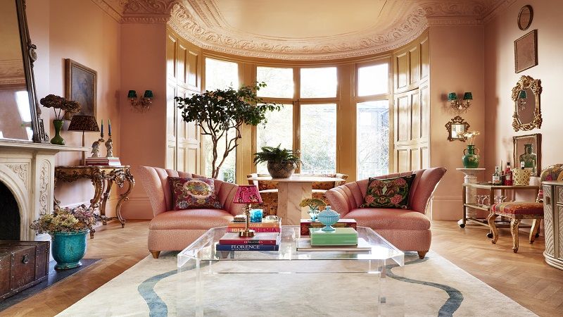
Colour is the most powerful tool in interiors, it is the simplest way to make your home immediately joyful and optimistic. Personally, I don’t have any rules as such when it comes to choosing a colour. I’d always recommend opting for those colours that you naturally gravitate toward; for me, it’s often muddy greens and soft, plaster-like pinks.
Everyone has different tastes, so narrow down what it is you love. I like to mix warm and cool tones together in the same room, as I find in most spaces there should be a balance of complementary colours for contrast, and it helps to create layers.
No matter what you go for, always remember that colour is one of the few interior design elements that can be changed quite easily, quickly, and affordably if you don’t like it. It’s not something which once chosen must remain forever, so it’s well worth giving it a go, having fun, and trying something new.
Do you think different rooms lend themselves better to certain colours?
Absolutely. The first step when choosing a colour for a particular room is to always think about how you want to feel in that space.
Do you want to feel calm and relaxed? If so, choose cool tones, from blue to green, and then work with a few additional shades similar to this colour base to dress the room with larger items. This creates a stylish, harmonious feel.
Are you feeling brave? Throw in some fuchsia pink velvet cushions or paint a picture frame neon orange to inject some personality first. If you love the result, go bigger. Colour may seem daunting initially, but if you take small steps and build on the layers of warm and cool tones, you will always feel comfortable.
Should I try colour drenching or opting for pops of colour?
Colour-drenched walls can be the single most effective and affordable way to transform and elevate a space, so if you want a big and bolder change, go for it. Opting for pops of colour, on the other hand, allows for a more flexible approach.
You can introduce vibrant hues through accessories, artwork or furniture, allowing you to experiment with different colour schemes and easily switch things up in the future.
I have a period home and am worried about losing its charm. How can I be bold whilst still being sensitive to period features?
Colour can be a wise move in any home when you are looking for an affordable, impactful update. Colour drenching rooms in one tone is a contemporary way to update a space, as it unifies all the surfaces and makes the most of otherwise hidden details such as architraves and cornices. Using a light tone to do this may be wise, rather than a bold saturated tone which can sometimes feel a little overpowering to live in. There are lots of colour and interior tips in my new book, Living Bright, which is split into chapters focused on different colours.
I always love to mix old and new pieces into a room. If your home has a period aesthetic full of character, it helps to throw in something modern and unexpected, and vice versa with a modern space. A curated mix of old and new pieces stops a room from feeling flat and lifeless.
Are there any colours which you think are just a trend and not here to stay?
Not really - I don’t really pay too much attention to trends in the home. Just like fashion, I think it’s worth taking interior trends with a pinch of salt and it’s wise to find your own personal style.
It’s great to be inspired but stick to what you really love when it comes to your home, as you spend so much in it. Soft plaster pink may well be having a moment right now in interior magazines, but it has always been my go-to neutral. Warmer than grey, more interesting than beige and more forgiving than white. For me it’s a colour that l’ll return to again and again for full wall coverage.
Should you approach your home with a theme, or can each room have a different personality?
I’m not a massive fan of an obviously themed room, especially in a domestic space. I think any theme should be restricted to a mood board to give you a steer, but perhaps try not to take things too literally in the finished space. Subtle themes can be good, but you want it to feel sophisticated and not gimmicky.
In my bathroom in Mallorca, the wallpaper is made up of painted beach shells. It’s a little nod to its location and the connection to water. The interior of the house is mostly decorated in blue, green and white tones to keep things fresh and loosely Balearic in theme, but personality is key to avoid the Spanish touches becoming too literal.
Do you have any final tips for someone just starting to use bolder colour?
One common pitfall is overwhelming the space with too many bold or clashing colours and patterns. It's essential to strike a balance and ensure that the colours work together to create a cohesive look.
It’s also important to not overlook the importance of lighting when choosing colours. Natural and artificial light can significantly affect how colours appear in a room. Always consider the lighting conditions in the space before finalising your colour choices; what works in your friend’s kitchen might not look the same in yours!
For someone starting out with using colour in their space, my key advice would be to start small. If you’re unsure about using bold colours, begin by incorporating them in small doses through accessories or accent pieces - like a scatter cushion, a frame, or a vase. This allows you to experiment without committing to a major colour scheme. Think about the mood you want to create in the room and choose colours that align with that vision. Look for inspiration in magazines, online, on social media, or even in nature, and pay attention to how colours are used in various settings and how they make you feel.
Lastly, design is subjective and there are no hard and fast rules when it comes to colour. Don’t be afraid to step out of your comfort zone and try unexpected combinations. Trust your instincts and have fun with the process!
Matthew Williamson’s Living Bright is a practical guide on finding your own style and embracing the paint pot.
We are using cookies to improve your experience. By continuing to use this website, you agree to the storing of cookies on your device to enhance site navigation, analyse site usage, and tailor content to your interests, in accordance with our Cookie Policy.